Crafting Experiences That Matter
Design isn't just about making things look good—it's about solving real problems and creating meaningful experiences. My process is the roadmap to achieving these goals, blending creativity with data-driven insights to deliver impactful solutions.
The Journey
Discover & Define
First things first: we need to know what we're solving. I dive deep into user research, competitive analysis, and cross-functional brainstorming. We're not just asking "what" - we're asking "why". A lean canvas helps us nail down users, value props, and key metrics. It's all about validating our assumptions before we go too far down the rabbit hole.

Prioritize & Plan
Ever tried to do everything at once? Yeah, it doesn't work. That's why I use faceted feature analysis to objectively prioritize what we're building. UX rates user value, product assesses business impact, and development evaluates feasibility. It's a team sport, and everyone's expertise counts.
Design & Research
This is where the magic happens. We kick off with sketching sessions or Design Sprints - it's amazing what a room full of smart people with Sharpies can come up with. We prototype early and often, testing with real users to inform our designs. I'm big on applying UX heuristics and refining information architecture. Clear, learnable environments across all platforms? That's the goal.
Develop & Test
Developers aren't an afterthought - they're partners from day one. I provide clear user stories with acceptance criteria. It streamlines QA and keeps development efficient. It's all about clarity and collaboration.
Measure & Iterate
Launch isn't the finish line - it's just the beginning. We're constantly gathering data, both qualitative and quantitative, to measure success and inform our next moves. Design is iterative, and I'm always looking for ways to improve the user experience.
Why It Works
This process isn't just theory—it's battle-tested across diverse projects:
At eHarmony, it helped streamline onboarding and increase user engagement.
For Tradesy, it uncovered crucial insights about first-time buyers, leading to improved conversion rates.
With Mitsubishi, it informed creative differentiation through competitive analysis.
The Impact
Following this process doesn't just lead to prettier designs. It:
Creates products users actually want to use (and businesses want to invest in)
Makes decisions based on data, not hunches
Fosters collaboration that leads to innovative solutions
Builds experiences that stand out in crowded markets
Let's Create Something Amazing
Ready to transform your ideas into impactful experiences? Let's apply this process to your next project and create something truly remarkable.
Design Process Examples
eHarmony User Journey
Embarking on a user journey takes investment. I illustrated this concept to help stakeholders understand how this could inform us about how users currently interact with our site. The stakeholder buy-in allowed us to begin collecting the qualitative and quantitative data to plot the user touch points.

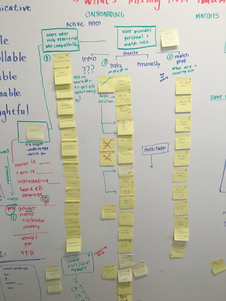
User Flow Workshop
This is the messy, creative work behind the onboarding user flow workshop. We explored flow variations and prioritization for profile, match preferences, and the compatibility questionnaire.
eHarmony High-fidelity User Flow
This user flow example displays the strategic thinking for onboarding new users through the relationship questionnaire, conversion, and communication between matches. Surprisingly, the interstitials did not increase drop-off and helped underscore the importance of long-term relationship success.

Information Architecture
Information architecture is the core of user experience. It makes the complex clear by providing a clear and organized structure of the data and information presented to users.
These are IA examples that help make complex information clear. It's important for users to experience a learnable environment whether in iOS, Android, mobile web and/or desktop, especially for a multi-device world.

eHarmony IA Cross-Platform Parity
A holistic vision and understanding can help to create a peaceful simplicity. I designed IA for iOS, Android, mobile web and desktop to highlight the disparity between platforms, to help bring harmony to the taxonomy and to transform the empty forward user paths by identifying meaningful transitions.

eHarmony RQ (Relationship Questionnaire) A/B Test
With the goal of reducing user fatigue when completing the relationship questionnaire, I led the effort to explore ideas for sequence reorganization, question removal and photo upload prioritization. This structure helped to reimagine the sections of match preferences, profile and compatibility.
RESEARCH
My training in user research was thorough and challenged me to continually strive for ethically unbiased user tests. It's important for product and UX teams to agree on the research objectives, to have a clear methodology and to verify that every single question provides an answer that will inform the design.
I have extensive experience with moderated and unmoderated research techniques to define customer needs and use cases, design real personas, creating storyboards, deep-dive into task analysis, and improve user flows.

First Time Buyer Research
We realized through our customer conversion data that we were having a problem retaining first-time buyers. The design team held a design sprint, produced a prototype, conducted user research and learned a lot. All participants wanted more information about the seller. We learned that the number of sales and a seller rating scale would tremendously increase trust and sell-through rates. The problem was that stakeholders wanted us to develop trust through Tradesy as a peer-to-peer marketplace but users told us they wanted more visibility into individual sellers.

Onboarding Experiment
Our challenge was to reimagine an engaging experience that helps buyers find relevant and enticing products. We created an onboarding experience to lead users to the right products from reputable sellers and encourages them to return again and again. We learned from our prototype that buyers don’t mind giving detailed preference information to get better recommendations. We also experimented with global preferences versus session-specific preferences.

Competitive Analysis - Mitsubishi
This is a competitive analysis I gathered for a Saatchi & Saatchi project. We identified competitive usability to inspire creative differentiation.
Heuristics
Heuristics are sometimes deemed 'old school' yet they are critical for establishing principles within our discipline. There are agile ways to establish this credibility within design rationale.

IA Heuristics Checklist – Redesigned
Abby Covert, an IA expert and author of “How to Make Sense of Any Mess” created a poster that references five important historical sources of information architecture and usability heuristics to provide a list of ten core heuristic principles. Each principle is paired with a checklist of thought-starter questions designed to facilitate better critiques.
I struggled to get my teams to use the poster so I converted it (with Abby’s permission) to a Figma file so that designers could use it as a checklist while they are designing. The file is available upon request.
Personas
The best personas I've designed have come from data. Begin with qualitative data and follow that up by combining both quantitative data to show cluster segmentation and qualitative research to understand perceptions, attitudes, and motivations. Typically I get as much data as I can in addition to qualitative research like analytics, demographics, social media behavior, competitive analysis, etc. Personas are a great way to model and communicate for whom we are designing.

Tradesy Seller Persona
This is an early example of a Seller persona representing a small data set of qualitative research. It’s a good start, but I pivoted our approach to a more robust data-driven initiative. We worked closely with the BI team to create a cluster-based segmentation analysis to allow us to identify associated traits and common behaviors for LTV users. After extrapolating the user patterns, we evaluated this data against additional qualitative research to help us learn perceptions, attitudes, concerns, and user motivations.